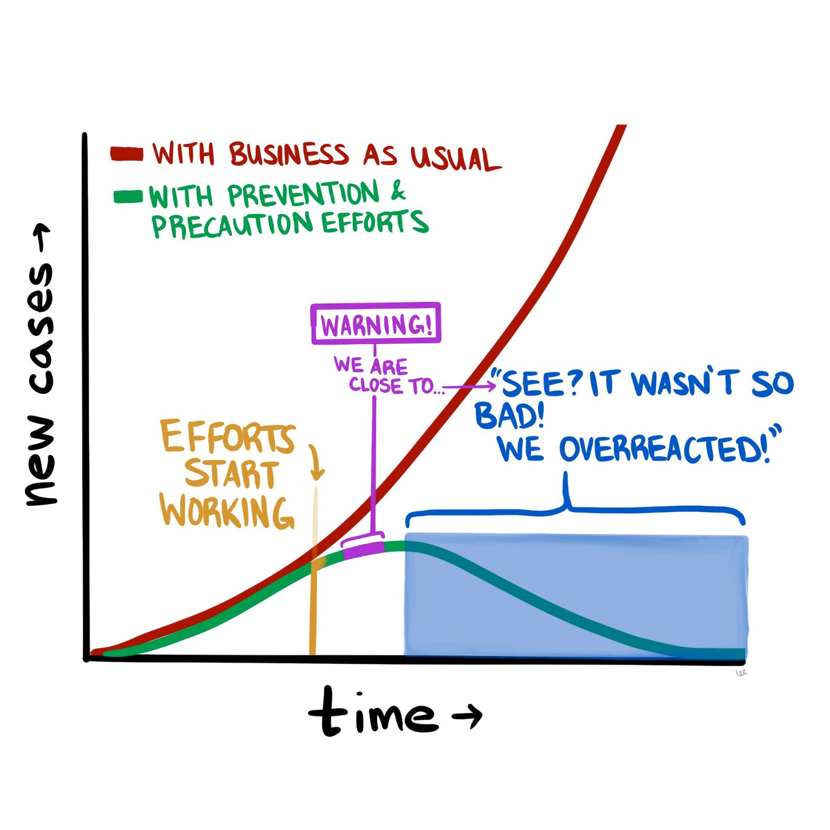
The COVID-19 pandemic is constantly evolving, but where we stand today looks a lot different than where we stood a month ago. The good news is that it doesn’t look nearly as catastrophic as it seemed in mid-March. The numbers of new cases and new deaths seem to be plateauing and even declining (slightly) in hotspots such as New York City. So now we are at a fork in the road, as the diagram above suggests. Do we continue the “lockdowns” in hard-hit parts of the country, to halt the further spread of the disease? Or do we begin to open up parts of the population (and economy), and inch back towards something resembling “normal?”
To contemplate, let alone answer, this question really digs into a much deeper question about the current state of affairs and how we got here. Are we in the somewhat favorable state we are in today because of how well we’ve contained the virus, how well we’ve “flattened the curve?” Or are we in this state because the SARS-CoV-2 virus is less deadly than we initially thought?
If possible, let’s try to have this discussion with as little emotion as possible. Instead, we should think about it through the lens of what we know about logic, supposition, and probabilities.
Let’s start with the early predictions that many people, myself included, found beyond frightening, but also at least somewhat plausible. Those predictions were produced by epidemiological models that used as inputs various properties assumed to be known about the virus, most importantly how readily it spread between people and how harmful it was to those who acquired it. And while these models varied wildly in their predicted outcomes—from 200,000 to more than 2 million deaths in the United States—they all have one thing in common, which is that the way things stand now, they appear wrong.
What follows is my current thinking about COVID-19 and the all-important models upon which we are basing our decisions, along with some suggestions of what we need to do to begin to break this logjam.
As I pointed out a few weeks ago, the models that predicted that ~60% of Americans would be infected and ~1.6 million of us would die in the coming 18 months were based on assumptions about SARS-CoV-2 and COVID-19 for which we had little to no data—specifically, the exact value of R_0 (i.e., how many new people each virus carrier infects, on average), the percentage of infected patients who will require hospitalization, and the fraction of infected patients who will die (i.e., infection fatality rate, or IFR). For the most part, we only know the case fatality rate (CFR) of COVID-19—that is, the number of confirmed positive patients who end up dying of the disease. This number is less helpful, because patients with the most severe symptoms (and probable bad outcomes) are more likely to be tested. So by definition the CFR must overestimate the IFR. This is a very important point, and it comes up again, so let’s be sure it’s clear before we proceed. The CFR is the ratio of deaths to known cases; the IFR is the ratio of deaths to total cases, known and unknown. If, as in the case of ebola, these are very similar, then using CFR for IFR will not take you too far off the mark. But what happens if the IFR is one-tenth of the CFR? In other words, what if the total number of unconfirmed infected persons is an order of magnitude larger than the number of confirmed cases?
We’ll come back to this. Let’s get back to the models.
The sensitivity of the models to one variable in particular is especially pronounced. If you want to experience this firsthand, play with the model described in this New York Times article, and see how even the smallest changes in the virus’s reproductive number, R_0, altered the outcome in seismic ways. For example, using the default parameters in place, simply changing the R_0 from 2.3 to 2.4 triples the projected number of infected people from 10 million to 30 million. Think about that for a second. A seemingly negligible increase in the per-person rate of transmission leads to a 3x difference in total infections! (According to the model, anyway.) And what if you assume R_0 is a “mere” 2.1 (still a very contagious virus, by the way)? Fewer than 1 million Americans could expect to be infected. Tiny changes in inputs make the difference between a catastrophe and a minor speed bump. As someone who used to make a living building models—and as someone who has been humbled by them (albeit for mortgage defaults, not pandemics)—I can tell you that when you have a model that behaves this way, you need to be even more cautious than you otherwise would, and should, be with any model.
Projections only matter if you can hold conditions constant from the moment of your prediction, and even then, it’s not clear if projections and models matter much at all if they are not based on actual, real-world data. In the case of this pandemic, conditions have changed dramatically (e.g., aggressive social distancing), while our data inputs remain guesswork at best.
So, absent actual data, assumptions about these parameters were made—guesses, actually—but these assumptions lacked the uncertainty that we would expect from actual epidemiological data. What do I mean by lacking in uncertainty? Imagine that you are trying to estimate the number of acorns in your neighborhood by the end of next year. You build a model that factors in many variables, such as the number of oak trees, the weather, and so on, but in the end you realize the model is most sensitive to the number of squirrels in your neighborhood and how much their weight changes over the winter. You could guess at those parameters. Or you could spend time measuring them and using actual data as the inputs to the model. If you choose the former, you are merely entering a value (or values) for the respective parameters. That’s your best guess. But if you choose the latter, you are probably not using a single, accurate number—it’s quite a project to count squirrels with any accuracy. Instead, you must use a probability distribution for the input.
Why? Because you are accepting the inherent uncertainty of the situation: Actually trying to count each and every squirrel, which would require an enormous effort and likely some draconian tactics, would still not yield a completely accurate number. It might be better to just count the squirrels on, say, one block, and multiply by the number of blocks, and adjust for other factors, and come up with a likely range of squirrel population numbers. This is not a pure guess, but neither is it an exact number, because when it comes to squirrels, and viruses, it is almost impossible to know their actual prevalence with total certainty.
As I learned when I was modeling mortgage credit risk, an A-plus model accounts for this inherent uncertainty by allowing you to use ranges of numbers (or better yet, a probability distribution curve) as inputs, instead of just static values. Instead of assuming every person who originated a mortgage in a particular tranche of risk has $3,000 in cash reserve for a rainy day, you might assume a probability distribution of cash reserve (and therefore financial runway prior to defaulting) that was normally distributed (i.e., shaped like a bell curve) around $3,000 or if you were really slick you’d get actual data from the Treasury or a consumer database that would give an even more nuanced probability function.1In reality, such a number would not be normally distributed because it is bounded below by zero, but technically has no upper bound, so the distribution of cash reserve would be skewed—and all of this could be approximated or measured. Obviously, knowing how much cash a person has in reserve is a very important factor in determining how long they will pay their mortgage in the event of an economic shock. (And rest assured that the major banks are furiously adjusting their own models in this regard right at this very moment.)
Back to our squirrels. If we choose to do the work and use actual data to inform our model, rather than our best point estimate, the input would be accompanied by a confidence level, or a measure of how certain you are that the correct answer lies in your range. Again, an A-plus model would have the ability to process the “number of squirrels” as 5,634 to 8,251 with 95% confidence. (For a quick primer on what it means to be “95% confident” in your guess, please take a few minutes to do this exercise). A B-minus model (or worse) would take one single number in for the number of squirrels and, worse yet, it would assume you have 100% certainty in that number. When a B-minus model gives you an “answer,” it has no range. It communicates no uncertainty. You have no ability to assign confidence to it, statistical or otherwise.
Unfortunately, most of the models used to make COVID-19 projections were not built to incorporate uncertain data, nor were they capable of spitting out answers with varying degrees of uncertainty. And while I suspect the people building said models realized this shortcoming, the majority of the press is not really mathematically or scientifically literate enough to point this out in their reporting. The result was a false sense of certainty, based on the models. I should emphasize that the models were off target not because the people who made them are ignorant or incompetent, but because we had little to no viable data to put into the models to begin with. We didn’t have several months to painstakingly count the squirrels. We didn’t even have a method for counting them. The best we could do was make guesses about squirrels, which we had never seen before, based on our understanding of bunnies and mice.
So, what does the future look like from where we stand today, versus a month ago? Do we have the same dire view of the future? Or has it changed?
Mine has changed. Quite a bit, actually. Today I suspect American fatalities from COVID-19 will be more in line with a very bad, perhaps the worst, season of influenza (The last decade saw flu deaths in the U.S. range from 12,000 to 61,000, so you can imagine how much variability exists). This suggests COVID-19 will kill tens of thousands in the U.S. this year, but likely not hundreds of thousands, and definitely not millions, as previously predicted.
What accounts for my different outlook today? There are really only two first-order explanations for why I can say the early projections were incorrect:
- Either the models were wrong because they incorrectly assigned properties about the biology of the virus pertaining to its lethality and/or ability to spread, or
- The models were correct, but as a society we changed our behavior enough in response to the threat of the virus to alter the outcome. In other words, the models were correct in assuming R_0 was high (north of 2.25 and in some estimates as high as 3), but aggressive measures of social distancing reduced R_0 to <1, thereby stopping the spread of the virus, despite its lethal nature.
It is, of course, most likely to be a combination of these two conditions; call them Case I and Case II, respectively. They are not mutually exclusive, either. In fact the jugular question today is how much of each? Is it 90/10, 10/90, or 50/50? If the predictions were wrong because we misunderstood the biology of the virus (overstating its risk significantly)—that is, we’re in a mostly Case I scenario—then we may start the process of thoughtful reintegration. If the predictions were wrong because we understood the biology, modeled it correctly, and appropriately put into place extreme social distancing measures—that is, we’re mostly in a Case II scenario—then we need to continue strict social distancing until we have effective treatments. Otherwise we risk a resurgence of disease that could dwarf what we are currently experiencing.
I have thought very long and hard about how to differentiate between these two scenarios—Case I vs Case II—and in my opinion the most effective and expeditious way to do so is to determine the seroprevalence of asymptomatic people in the major cities in the U.S., starting with the epicenter, NYC. In other words, find out (via blood testing for antibodies) how many people were already infected that weren’t captured as “confirmed cases.” Ideally, we would be able to do that by testing every single person in the city (that is, counting all the squirrels). But because that is infeasible, we should test as large a cross-section of the asymptomatic NYC population as possible, and extrapolate from the results. Either way, we need to broadly test people with no symptoms, which is something we have not done so far in an area hit as hard as NYC.
These data are enormously important. If the asymptomatic prevalence in NYC is 5%, meaning 5% of asymptomatic persons in NYC have been infected, while 95% have not, it would imply the IFR for COVID-19 is approximately 2.4%. This is a deadly virus, approximately 25x more deadly than seasonal influenza in NYC.2Bear in mind that the widely reported CFR of 0.1% for influenza runs into the same problem we have with COVID-19: the IFR of seasonal influenza may be a fraction of its CFR. It would also imply that efforts to contain the spread have been effective and/or the R_0 of the virus (the reproduction number) is much lower than has been estimated (2.2 to 2.6).
Conversely, if the asymptomatic prevalence in NYC is, say, 30%, it would imply that the IFR for COVID-19 is approximately 0.4%. This is a far less deadly virus than previously suggested, although still approximately 4x more deadly than influenza in NYC.3And it’s not an apples-to-apples comparison because healthcare workers are immunized, albeit modestly, to influenza, as are many high risk people, while no one is immunized to SARS-CoV-2. When the dust settles, I suspect much of the spread of this virus will likely trace to nosocomial sources that would normally be less in the case of influenza. It also implies that the disease is far more widespread than previously suggested. If 30 percent of New Yorkers have been infected, then efforts to prevent its spread have not been very successful, but NYC is approaching herd immunity (see figure and table, below, which show the relationship between R_0 and herd immunity).
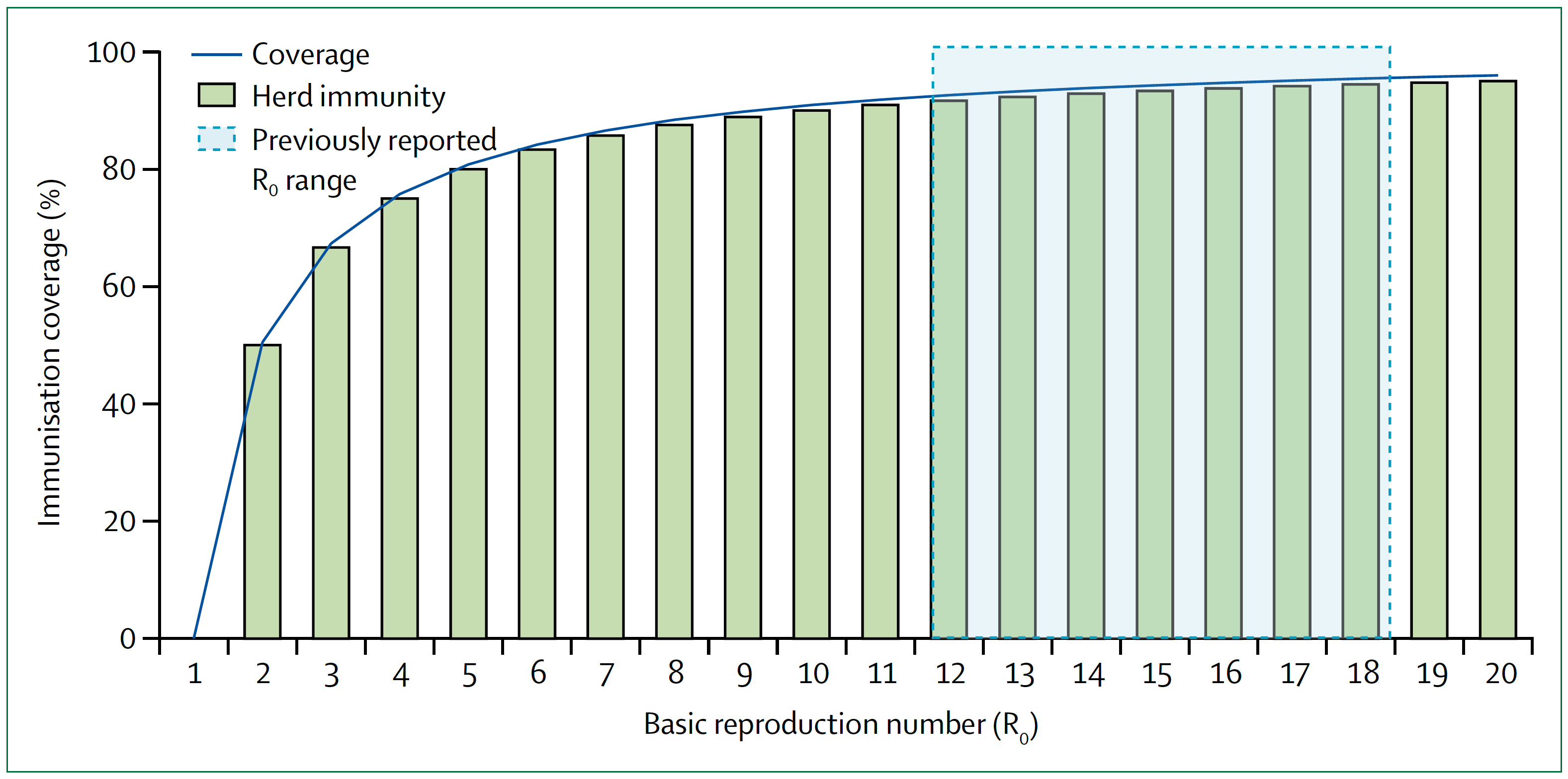
Figure. Measles basic reproduction number, herd immunity, and coverage. As R_0 increases, higher immunisation coverage is needed to achieve herd immunity. Blue zone indicates the R_0 estimate for measles of 12–18. In the context of COVID-19, notice the higher the R_0, the higher the threshold to reach herd immunity. Image credit: Guerra et al., 2017
§
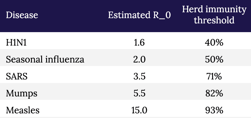
Table. Estimated R_0 and herd immunity thresholds for different infectious diseases.
The sooner we know how the virus behaved in the most hard-hit city in the country (and likely the world), the sooner we can start making better decisions with at least some modicum of confidence, versus blind certainty in models that don’t have the humility to incorporate a margin of error or degree of uncertainty. And of course, the models should also be to take into account regional and demographic variation. It seems likely that in some areas we will need to remain cautious, while in others less so; with some people we will need to remain cautious, while in others less so. For example, the virus clearly seems to spread more rapidly (meaning, the R_0 is higher) in NYC than in, say, Utah. And clearly some people are much more susceptible to major illness and death than others.
Testing broadly, especially asymptomatic people, to better estimate the true fatality rate is an essential part of any strategy to move forward. Doing so, especially if we can add more elaborate tools for contact tracing, can give us real data on the most important properties of the virus: how rapidly it spreads and how harmful it is to all people, not just the ones we already know about. And that data, in turn, will help us build better and more accurate models.
But we shouldn’t look at models to give us the “answers.” How many people will be hospitalized, how many people will die, and so on. That’s our natural, lazy inclination. Instead we should look to the models to show us how to change the answers. That’s why they are important, and why it is so important that those models a) accept uncertainty, and b) are based on the best data we can obtain. The model is not a prophet. It is simply a tool to help us understand the biology of what is happening, and to help us figure out what we have to do next.
Go back in time to March 1: Knowing what we knew then, quarantine and extreme social distancing was absolutely the right thing to do because we didn’t even know what we didn’t know, and we needed to slow the clock down. It was like taking a timeout early in the first quarter after your opponent has just scored two lightning touchdowns in a rapid succession. It may have seemed unnecessary to some, but we needed to figure out what was going on.
The mistake was not taking the timeout. The mistake was not using our timeout to better understand our opponent. We failed to scale up testing and gather the essential information outlined here that would have helped us create better, more nuanced and hopefully more accurate models, rather than having to essentially guess at our data inputs (and hence at the outcomes). Now, six weeks later, we are still in the dark because we didn’t do the broad testing that we should have done back then. We still don’t know fully how many people contract this virus and come out relatively unscathed.
We still have time to reduce the health and economic damage done by this virus and our response to it, but we can’t waste another timeout sitting around looking at each other and guessing.
– Peter
Thanks for sharing this Peter, it’s good to see these thoughts in high resolution.
My own assessment mirrors much of yours. I think that high quality serological data is one of our most powerful information generating tools. But I also believe that we can generate valuable information by performing societal experiments with modifying restrictions on distancing. An important note here is that no matter what modifications we do, we should set in place solid guidelines and measures to protect high risk groups. These modifications are targeted, not bluntly applied.
A very simple algorithm is to start with a ‘dose’ as close to subthreshold as possible – say, opening up public parks and amenities (while perhaps putting measures in place to encourage appropriately sparse interactions), and wait 2 weeks. See what the resulting second wave looks like and re-calibrate from there. Maybe we find that the second wave is too great, so we back off. Maybe we find that the second wave is a bare blip, so we open up nurseries, kindergarten, and day care. And so on and so forth.
Each experimental step we take does three critical things:
1) It revitalizes society.
2) Herd immunity begins to develop (herd immunity is a GREAT thing).
3) We gain information from the experiment, which informs our next decision. The resulting data also informs the rest of the planet.
Even if 2) doesn’t apply, due to lack of exposure-induced immunity, 1) and 3) are enough for this argument to hold.
Given what we know based on a number of different pieces of information (e.g. existing serological work, the current Swedish experience, etc.), and given what we know and can imagine about the society destroying effects of remaining in this mode, I believe a proper risk analysis would conclude that taking that first tentative step is a better move than what we are currently doing.
We seem to have lost perspective of risk in many parts of the world. Allowing deaths to occur is something we have been doing throughout our history. Every year, hundreds of thousands perish to influenza. We could almost certainly reduce that number of deaths if we sheltered in place all flu season, and re-opened up once the transmission environment became more hostile to the virus. Right now it seems cold blooded to allow deaths, and this is because we have never paused society (and thus we have never paused the influx of deaths associated with a functioning society, such as car accidents, and the flu). Now that we have paused, we see the truth for what it is, and the decision to act is enforced upon us. We are not quite as sensitive to decisions of inaction, even though they bear the same consequences . Inaction during flu season kills people, and action taken during the current pandemic (in the form of gradually re-opening society) will also kill people, yet we are not psychologically built to treat action and inaction symmetrically.
I appreciate Steve S.’s point that we shouldn’t be forced to choose between two polarized options.
What dismays me the most is that COVID-19 has now been so politicized that we may not be able to choose a nuanced option.
We’re being forced into polarization because the loudest voices (who seem to have captured a preponderance of media attention) are making it seem like we must literally “live free or die.”
One more thought that should weigh on our minds if comparing to the flu (or any other pathogen)… the newness of this virus.
When dealing with influenza, there’s already a basic level of herd immunity in our population. We’re essentially just keeping-up with the mutations year after year, and that’s driving the 0.1% fatality rate. Had the coronavirus been in circulation as long as influenza has, the fatality rate would be even lower. What we’re seeing is the “low-hanging fruit” or those predisposed to death by Covid-19. Had those deaths been spread across the last 10 or 20 years, we’d think very little of it. The novelty and uncertainty are playing into our fears and throwing our political and societal lives way out of balance for practically no reason (in the grand scheme of things). Yet to argue the big picture perspective is somehow inhumane? Nobody wishes death on anyone, but we live in a world full of suffering and must deal with that reality instead of cowering in our cave-dwellings.
“What’s wrong with the models?”
Answer: The models were not peer reviewed, and the key model input Ro was not calculated correctly, so the model output was wrong. (Also known as “garbage in, garbage out”.) The correct Ro indicating growth rate of the epidemic was much less than the range of Ro values used in the model simulations.
The Ro was calculated incorrectly based on using the graph of increasing number of cases per day, as shown in Peter’s chart above, but likely without considering the bias effect of the increasing number of tests per day on that curve. The “epidemic” curve shown above is mostly (maybe entirely) just an artifact of the increasing number of tests. It is curious that a plot of just the number of tests will look like a typical epidemic curve. The percentage of test-positive results (cases) was about constant or slow increase over March for USA and EU countries, according to swprs.com — which implies no increasing epidemic. If you multiply that fairly constant percentage (#cases/#tests) by the increasing testing curve, you can then generate the scary increasing case curve that Peter is showing and that fed the news media’s narrative.
It appears that the CDC controlled the rate of testing–
Richard had posted here (Apr 23 at 8:09 a.m.): “The FDA gave the CDC a monopoly on the test kits, going so far as to shut down an alternative developed at the University of Washington. The CDC then didn’t ramp up production and what production of test kits they did was contaminated. This crippled the early testing process.”
The tests were doled out in a pattern that mimics an epidemic curve.
And I note that the CDC did not timely provide the relevant metric, which was the percentage of positive tests each day. If they had done so, it would have changed the narrative, as the relevant metric (percentage) would have revealed a slow or no epidemic growth during March. The relevant curve has been flatter all along.
(*Note: To correctly calculate the percentage #cases/#tests each day, one must correctly match the dates for both, and this is hard to do since CDC has back-dated the dates for the reported cases… so be careful, else the date offset will cause up to 4x error.)
Kudos, great article. I would not be surprised if you have a deep background in statistics.
great work, Peter
I’m imagine your a Bayesian, especially in incorporating measures of uncertainty – I have worked on Bayesian models in eye surgery, especially predicting outcomes, but most MDs don’t like Uncertainty – But the sooner we accept it, the faster we will understand our prescriptions, be they lockdowns, surgery, etc.
Thanks for your work
Great discussion. I think it’s clear that the number of people infected is dramatically under-counted. Anecdotally, here in Seattle I know over a dozen people who almost certainty had the virus, but weren’t tested or counted. And most had spouses who were clearly exposed and had lighter symptoms. All this was in mid-late Feb before there was much awareness or testing. And we all were out in circulation.
Refs: https://www.heraldnet.com/news/a-wholesome-activity-leads-to-infection-square-dancing/
https://www.nytimes.com/2020/04/22/us/coronavirus-sequencing.html
Thanks for the great article, Peter. With regard to your squirrel analogy, you seem to be describing fixed versus random effects. However, where my confusion lies is that we have the ability to develop mixed effects models. We don’t have to count all of the squirrels and we don’t have to pretend that we have by using a fixed effect. I haven’t looked specifically at the models to which you are referring, but I’m a bit shocked by the implication of your article that people building the models have been using fixed effects in place of what are certainly random effects. Is this what you are implying or have I misunderstood?
I would love to see this article updated in light of the L.A. serology study estimating that 4.1% of the population has been affected. This put us in the « more deadly than the flu » category, does it not?
This article includes some very important points about uncertainty but seems to miss the central question for how much social distancing we should be doing. We are not social distancing based on the IFR OR CFR. The IFR/CFR is really a proxy for (and a measure of) healthcare demand/capacity matching which is what this is all about. Unless a “cure” is in our near future we will deal with a curve, flat or spiked. Those are our choices. Given enough time, the area under the curves is not terribly different. Therefore, there will eventually be the same number of cases more or less. If the healthcare capacity is overwhelmed, non-emergent cases are cancelled, patients avoid hospitals, doctors avoid patients, hospital care of COVID patients (all patients) is degraded and more people die. If capacity is not overwhelmed then the lowest possible IFR and CFR are maintained and people with early cancer get treatment, people with CP get their MIs diagnosed and treated, etc. Your article is all about CFR vs IFR which is irrelevant to social distancing in the short term. Eventually, IF there is immunity from mild/asymptomatic cases, then the larger denominator will impact the shape of the curve independent of social distancing.
Ivan Miller MD FACEP
New York
Hi Ivan,
I disagree with the statement below:
“Given enough time, the area under the curves is not terribly different.”
Many studies have shown that the infection rate may be less than 40% if proper mitigation (social distancing) is done versus over 70% if mitigation is not done properly. That is a huge difference in # of deaths. Also, a more flat curve assists with buying time to: find more effective therapeutic treatments thus hopefully decreasing the IFR (i.e laying on the stomach while vented+remdesivir), not have hospitals overrun (i.e. NYC, Detroit), giving us time to improve our testing, isolating, tracing capabilities. If those capabilities of ours were as good as China,Taiwan, South Korea we could really hold this virus way way down while vaccine is being created. Apple & Google are working a partnership for contact tracing currently as well.
We still don’t have the CFR, and never will.
A study in Italy showed that only 12% of the deaths attributed to the virus were actually caused by the virus. The CDC guidelines do not require a positive test to list the virus on the death certificate. If a person on Medicare/caid has pneumonia, the hospital gets $5,000. The same person has pneumonia and COVID, the hospital gets $13,000. There are so many people whose deaths are counted as from COVID that aren’t the cause of death and with an unknown IFR, the statistics are worthless.
We were scammed for what is a slightly worse than average flu season.
Please don’t spread disinformation to support an unsubstantiated claim that hospitals are engaging in, according to your post, the greatest instance of systemic fraud in our medical system’s history. You’re claim is likely based on one Senator’s “musings” on Fox News, which have no evidence in support. Extraordinary claims require extraordinary evidence, and you provide no evidence to support such a massive fraud. Factcheck.org addressed these claims last week, and found no evidence to support this. I won’t restate the facts, but they’re easy to find on the site.
On this one, I totally agree with you. Here’s an Update from Dr. Jay Bhattacharya following his study on antibodies in Santa Clara county: https://www.youtube.com/watch?v=k7v2F3usNVA
We are now at over 66,000 deaths in about two months so, yes, worse than the 61,000 over the course of a year from a few years back. Almost certain to cross the Hong Kong Flu line of 100,000 from the 60s.
Lowest numbers put this as twice as “deadly” as the flu, most probable numbers accounting for the many asymptomatic uncounted puts it at five to ten times as “deadly”. But with no natural immunity and no vaccine, we are relying entirely on new herd immunity to limit how many catch this, so whatever percentage you pick it will certainly be a percentage of a much higher overall pool. Future years may see this flu simply doubling our regular flu season deaths, but this year it’s going to hit hard no matter what we do, and hit very hard with some choices.
I’m also not seeing anyone accounting for the fact that we have already been through our seasonal flu peak. Not trying to be harsh, but a lot of people that “would have” died from COVID had already died earlier in the year from influenza a or b.
Overreaction and under-reaction are fueling each other right now.
The models I have seen at my US university and what I saw elsewhere at the start of this pandemic did calculate with 0.5 infection fatality rate. A very important point is that for some people depending on age and underlying conditions it is way worse, and we are seeing this in the USA too. I think it is dangerous to downplay the models in a general way. Yes they are only models and a change in behavior plus very importantly unknown factors as you said very well can change them profoundly, but it is important to take a good look at what would happen if these parameters, that were not just guessed but taken from observations in other countries, were true. And the comparison “a bad flu season” is hard to hear for me again and again. For some people this may sound like great, then I don’t need to change anything in my behavior since I don’t change it for the fu either and this will cost many lives. I completely agree that we need to use the tie better to understand the enemy and adjust strategies!
Almost a year ago..
would you care to look back at your prediction vs. reality?