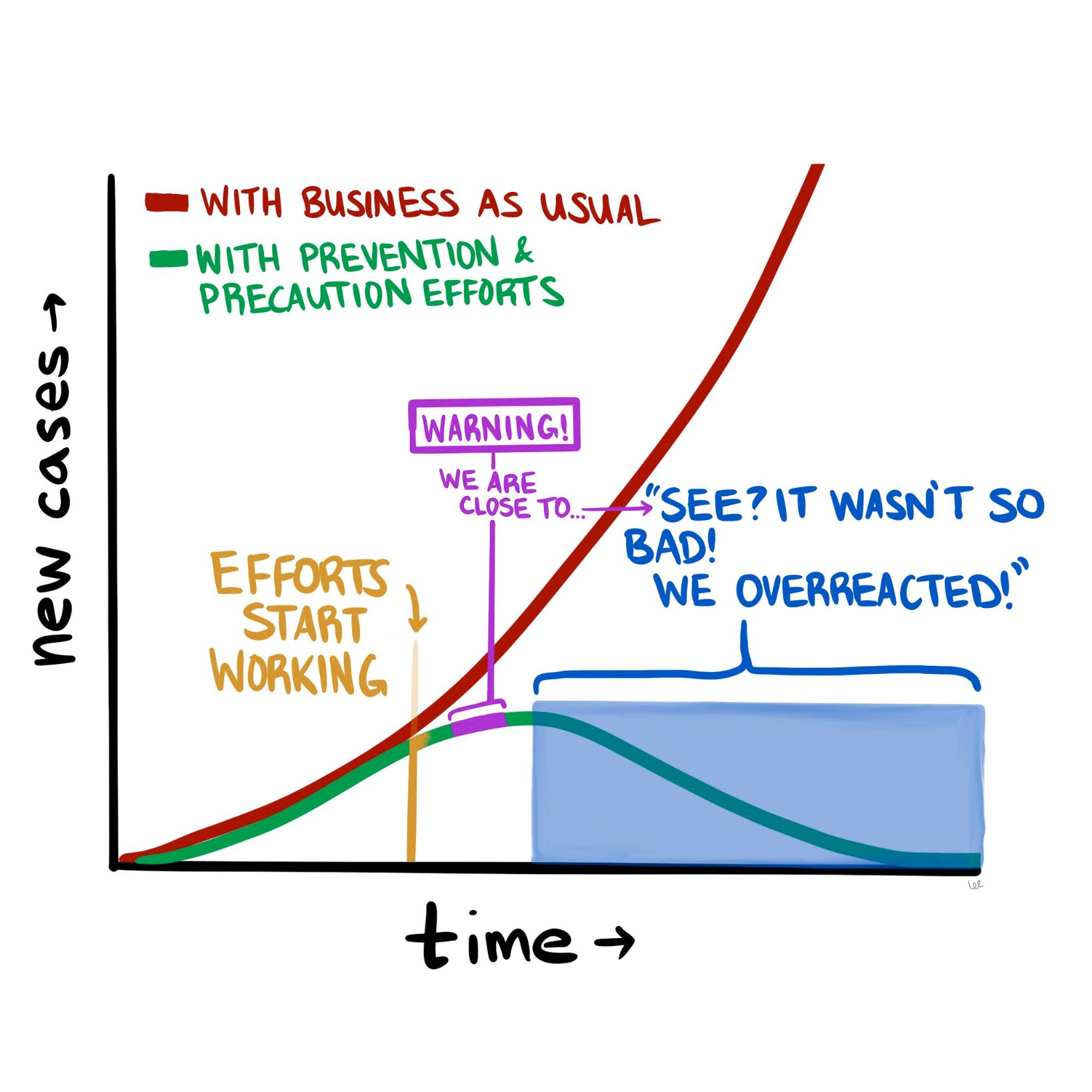
The COVID-19 pandemic is constantly evolving, but where we stand today looks a lot different than where we stood a month ago. The good news is that it doesn’t look nearly as catastrophic as it seemed in mid-March. The numbers of new cases and new deaths seem to be plateauing and even declining (slightly) in hotspots such as New York City. So now we are at a fork in the road, as the diagram above suggests. Do we continue the “lockdowns” in hard-hit parts of the country, to halt the further spread of the disease? Or do we begin to open up parts of the population (and economy), and inch back towards something resembling “normal?”
To contemplate, let alone answer, this question really digs into a much deeper question about the current state of affairs and how we got here. Are we in the somewhat favorable state we are in today because of how well we’ve contained the virus, how well we’ve “flattened the curve?” Or are we in this state because the SARS-CoV-2 virus is less deadly than we initially thought?
If possible, let’s try to have this discussion with as little emotion as possible. Instead, we should think about it through the lens of what we know about logic, supposition, and probabilities.
Let’s start with the early predictions that many people, myself included, found beyond frightening, but also at least somewhat plausible. Those predictions were produced by epidemiological models that used as inputs various properties assumed to be known about the virus, most importantly how readily it spread between people and how harmful it was to those who acquired it. And while these models varied wildly in their predicted outcomes—from 200,000 to more than 2 million deaths in the United States—they all have one thing in common, which is that the way things stand now, they appear wrong.
What follows is my current thinking about COVID-19 and the all-important models upon which we are basing our decisions, along with some suggestions of what we need to do to begin to break this logjam.
As I pointed out a few weeks ago, the models that predicted that ~60% of Americans would be infected and ~1.6 million of us would die in the coming 18 months were based on assumptions about SARS-CoV-2 and COVID-19 for which we had little to no data—specifically, the exact value of R_0 (i.e., how many new people each virus carrier infects, on average), the percentage of infected patients who will require hospitalization, and the fraction of infected patients who will die (i.e., infection fatality rate, or IFR). For the most part, we only know the case fatality rate (CFR) of COVID-19—that is, the number of confirmed positive patients who end up dying of the disease. This number is less helpful, because patients with the most severe symptoms (and probable bad outcomes) are more likely to be tested. So by definition the CFR must overestimate the IFR. This is a very important point, and it comes up again, so let’s be sure it’s clear before we proceed. The CFR is the ratio of deaths to known cases; the IFR is the ratio of deaths to total cases, known and unknown. If, as in the case of ebola, these are very similar, then using CFR for IFR will not take you too far off the mark. But what happens if the IFR is one-tenth of the CFR? In other words, what if the total number of unconfirmed infected persons is an order of magnitude larger than the number of confirmed cases?
We’ll come back to this. Let’s get back to the models.
The sensitivity of the models to one variable in particular is especially pronounced. If you want to experience this firsthand, play with the model described in this New York Times article, and see how even the smallest changes in the virus’s reproductive number, R_0, altered the outcome in seismic ways. For example, using the default parameters in place, simply changing the R_0 from 2.3 to 2.4 triples the projected number of infected people from 10 million to 30 million. Think about that for a second. A seemingly negligible increase in the per-person rate of transmission leads to a 3x difference in total infections! (According to the model, anyway.) And what if you assume R_0 is a “mere” 2.1 (still a very contagious virus, by the way)? Fewer than 1 million Americans could expect to be infected. Tiny changes in inputs make the difference between a catastrophe and a minor speed bump. As someone who used to make a living building models—and as someone who has been humbled by them (albeit for mortgage defaults, not pandemics)—I can tell you that when you have a model that behaves this way, you need to be even more cautious than you otherwise would, and should, be with any model.
Projections only matter if you can hold conditions constant from the moment of your prediction, and even then, it’s not clear if projections and models matter much at all if they are not based on actual, real-world data. In the case of this pandemic, conditions have changed dramatically (e.g., aggressive social distancing), while our data inputs remain guesswork at best.
So, absent actual data, assumptions about these parameters were made—guesses, actually—but these assumptions lacked the uncertainty that we would expect from actual epidemiological data. What do I mean by lacking in uncertainty? Imagine that you are trying to estimate the number of acorns in your neighborhood by the end of next year. You build a model that factors in many variables, such as the number of oak trees, the weather, and so on, but in the end you realize the model is most sensitive to the number of squirrels in your neighborhood and how much their weight changes over the winter. You could guess at those parameters. Or you could spend time measuring them and using actual data as the inputs to the model. If you choose the former, you are merely entering a value (or values) for the respective parameters. That’s your best guess. But if you choose the latter, you are probably not using a single, accurate number—it’s quite a project to count squirrels with any accuracy. Instead, you must use a probability distribution for the input.
Why? Because you are accepting the inherent uncertainty of the situation: Actually trying to count each and every squirrel, which would require an enormous effort and likely some draconian tactics, would still not yield a completely accurate number. It might be better to just count the squirrels on, say, one block, and multiply by the number of blocks, and adjust for other factors, and come up with a likely range of squirrel population numbers. This is not a pure guess, but neither is it an exact number, because when it comes to squirrels, and viruses, it is almost impossible to know their actual prevalence with total certainty.
As I learned when I was modeling mortgage credit risk, an A-plus model accounts for this inherent uncertainty by allowing you to use ranges of numbers (or better yet, a probability distribution curve) as inputs, instead of just static values. Instead of assuming every person who originated a mortgage in a particular tranche of risk has $3,000 in cash reserve for a rainy day, you might assume a probability distribution of cash reserve (and therefore financial runway prior to defaulting) that was normally distributed (i.e., shaped like a bell curve) around $3,000 or if you were really slick you’d get actual data from the Treasury or a consumer database that would give an even more nuanced probability function.1In reality, such a number would not be normally distributed because it is bounded below by zero, but technically has no upper bound, so the distribution of cash reserve would be skewed—and all of this could be approximated or measured. Obviously, knowing how much cash a person has in reserve is a very important factor in determining how long they will pay their mortgage in the event of an economic shock. (And rest assured that the major banks are furiously adjusting their own models in this regard right at this very moment.)
Back to our squirrels. If we choose to do the work and use actual data to inform our model, rather than our best point estimate, the input would be accompanied by a confidence level, or a measure of how certain you are that the correct answer lies in your range. Again, an A-plus model would have the ability to process the “number of squirrels” as 5,634 to 8,251 with 95% confidence. (For a quick primer on what it means to be “95% confident” in your guess, please take a few minutes to do this exercise). A B-minus model (or worse) would take one single number in for the number of squirrels and, worse yet, it would assume you have 100% certainty in that number. When a B-minus model gives you an “answer,” it has no range. It communicates no uncertainty. You have no ability to assign confidence to it, statistical or otherwise.
Unfortunately, most of the models used to make COVID-19 projections were not built to incorporate uncertain data, nor were they capable of spitting out answers with varying degrees of uncertainty. And while I suspect the people building said models realized this shortcoming, the majority of the press is not really mathematically or scientifically literate enough to point this out in their reporting. The result was a false sense of certainty, based on the models. I should emphasize that the models were off target not because the people who made them are ignorant or incompetent, but because we had little to no viable data to put into the models to begin with. We didn’t have several months to painstakingly count the squirrels. We didn’t even have a method for counting them. The best we could do was make guesses about squirrels, which we had never seen before, based on our understanding of bunnies and mice.
So, what does the future look like from where we stand today, versus a month ago? Do we have the same dire view of the future? Or has it changed?
Mine has changed. Quite a bit, actually. Today I suspect American fatalities from COVID-19 will be more in line with a very bad, perhaps the worst, season of influenza (The last decade saw flu deaths in the U.S. range from 12,000 to 61,000, so you can imagine how much variability exists). This suggests COVID-19 will kill tens of thousands in the U.S. this year, but likely not hundreds of thousands, and definitely not millions, as previously predicted.
What accounts for my different outlook today? There are really only two first-order explanations for why I can say the early projections were incorrect:
- Either the models were wrong because they incorrectly assigned properties about the biology of the virus pertaining to its lethality and/or ability to spread, or
- The models were correct, but as a society we changed our behavior enough in response to the threat of the virus to alter the outcome. In other words, the models were correct in assuming R_0 was high (north of 2.25 and in some estimates as high as 3), but aggressive measures of social distancing reduced R_0 to <1, thereby stopping the spread of the virus, despite its lethal nature.
It is, of course, most likely to be a combination of these two conditions; call them Case I and Case II, respectively. They are not mutually exclusive, either. In fact the jugular question today is how much of each? Is it 90/10, 10/90, or 50/50? If the predictions were wrong because we misunderstood the biology of the virus (overstating its risk significantly)—that is, we’re in a mostly Case I scenario—then we may start the process of thoughtful reintegration. If the predictions were wrong because we understood the biology, modeled it correctly, and appropriately put into place extreme social distancing measures—that is, we’re mostly in a Case II scenario—then we need to continue strict social distancing until we have effective treatments. Otherwise we risk a resurgence of disease that could dwarf what we are currently experiencing.
I have thought very long and hard about how to differentiate between these two scenarios—Case I vs Case II—and in my opinion the most effective and expeditious way to do so is to determine the seroprevalence of asymptomatic people in the major cities in the U.S., starting with the epicenter, NYC. In other words, find out (via blood testing for antibodies) how many people were already infected that weren’t captured as “confirmed cases.” Ideally, we would be able to do that by testing every single person in the city (that is, counting all the squirrels). But because that is infeasible, we should test as large a cross-section of the asymptomatic NYC population as possible, and extrapolate from the results. Either way, we need to broadly test people with no symptoms, which is something we have not done so far in an area hit as hard as NYC.
These data are enormously important. If the asymptomatic prevalence in NYC is 5%, meaning 5% of asymptomatic persons in NYC have been infected, while 95% have not, it would imply the IFR for COVID-19 is approximately 2.4%. This is a deadly virus, approximately 25x more deadly than seasonal influenza in NYC.2Bear in mind that the widely reported CFR of 0.1% for influenza runs into the same problem we have with COVID-19: the IFR of seasonal influenza may be a fraction of its CFR. It would also imply that efforts to contain the spread have been effective and/or the R_0 of the virus (the reproduction number) is much lower than has been estimated (2.2 to 2.6).
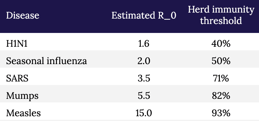
Conversely, if the asymptomatic prevalence in NYC is, say, 30%, it would imply that the IFR for COVID-19 is approximately 0.4%. This is a far less deadly virus than previously suggested, although still approximately 4x more deadly than influenza in NYC.3And it’s not an apples-to-apples comparison because healthcare workers are immunized, albeit modestly, to influenza, as are many high risk people, while no one is immunized to SARS-CoV-2. When the dust settles, I suspect much of the spread of this virus will likely trace to nosocomial sources that would normally be less in the case of influenza. It also implies that the disease is far more widespread than previously suggested. If 30 percent of New Yorkers have been infected, then efforts to prevent its spread have not been very successful, but NYC is approaching herd immunity (see figure and table, below, which show the relationship between R_0 and herd immunity).
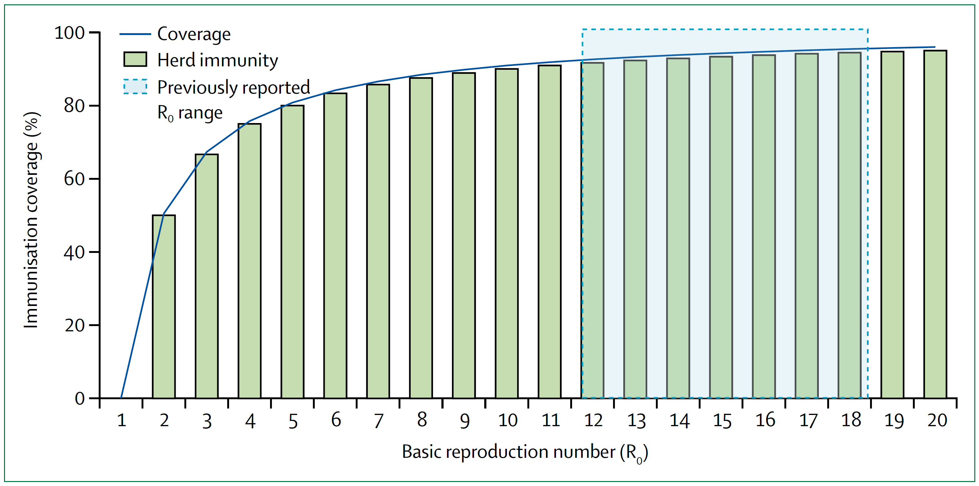
Figure. Measles basic reproduction number, herd immunity, and coverage. As R_0 increases, higher immunisation coverage is needed to achieve herd immunity. Blue zone indicates the R_0 estimate for measles of 12–18. In the context of COVID-19, notice the higher the R_0, the higher the threshold to reach herd immunity. Image credit: Guerra et al., 2017
§
Table. Estimated R_0 and herd immunity thresholds for different infectious diseases.
The sooner we know how the virus behaved in the most hard-hit city in the country (and likely the world), the sooner we can start making better decisions with at least some modicum of confidence, versus blind certainty in models that don’t have the humility to incorporate a margin of error or degree of uncertainty. And of course, the models should also be to take into account regional and demographic variation. It seems likely that in some areas we will need to remain cautious, while in others less so; with some people we will need to remain cautious, while in others less so. For example, the virus clearly seems to spread more rapidly (meaning, the R_0 is higher) in NYC than in, say, Utah. And clearly some people are much more susceptible to major illness and death than others.
Testing broadly, especially asymptomatic people, to better estimate the true fatality rate is an essential part of any strategy to move forward. Doing so, especially if we can add more elaborate tools for contact tracing, can give us real data on the most important properties of the virus: how rapidly it spreads and how harmful it is to all people, not just the ones we already know about. And that data, in turn, will help us build better and more accurate models.
But we shouldn’t look at models to give us the “answers.” How many people will be hospitalized, how many people will die, and so on. That’s our natural, lazy inclination. Instead we should look to the models to show us how to change the answers. That’s why they are important, and why it is so important that those models a) accept uncertainty, and b) are based on the best data we can obtain. The model is not a prophet. It is simply a tool to help us understand the biology of what is happening, and to help us figure out what we have to do next.
Go back in time to March 1: Knowing what we knew then, quarantine and extreme social distancing was absolutely the right thing to do because we didn’t even know what we didn’t know, and we needed to slow the clock down. It was like taking a timeout early in the first quarter after your opponent has just scored two lightning touchdowns in a rapid succession. It may have seemed unnecessary to some, but we needed to figure out what was going on.
The mistake was not taking the timeout. The mistake was not using our timeout to better understand our opponent. We failed to scale up testing and gather the essential information outlined here that would have helped us create better, more nuanced and hopefully more accurate models, rather than having to essentially guess at our data inputs (and hence at the outcomes). Now, six weeks later, we are still in the dark because we didn’t do the broad testing that we should have done back then. We still don’t know fully how many people contract this virus and come out relatively unscathed.
We still have time to reduce the health and economic damage done by this virus and our response to it, but we can’t waste another timeout sitting around looking at each other and guessing.
– Peter
Hi Peter,
I think you are making one common mistake when looking at models by focusing on the “peak” numbers (how many will die? what’s the IFR?) – the primary objective the models is to explain the dynamics of the epidemic rather than to try to predict the amplitude of the peaks. The dynamics of the epidemic will dictate who much economic handicap we have to endure and for how long.
What models are trying to answer are questions such as:
– What happens if we ease measures?
– Which measure has the most effect on the spread and how? (quarantine, hygiene, economic lockdown)
– How do those measures impact R0 and in consequence the amount of required recovered people for herd immunity?
I’ve done my own modeling via simulations and what I’ve learned is the following:
– Small changes in the economic lockdown measures after the initial full lockdown can cause an exponential increase in cases within as little as10 days, so decision makers need to take a very gradual approach to re-opening the economy (ease a bit, then test/watch curve, rinse and repeat) so they don’t overrun the hospitals
– Even with 10x lower IFR, hospitals will get overrun if we ease the lockdown too fast and allow these spikes to happen
– A lower IFR and higher asymptomatics will increase the speed at which we can reach herd immunity and go back to normal, but this is a bit wishful thinking. Latest preliminary antibody seroprevalencese studies are showing an average of 3% have been infected [1]. This is low and hopefully new studies will show higher numbers. But keep in mind the antibody tests are still quite inaccurate (high rate of false positives)
1- https://www.reuters.com/article/us-health-coronavirus-netherlands-study/dutch-study-suggests-3-of-population-may-have-coronavirus-antibodies-idUSKCN21Y102
https://www.medrxiv.org/content/10.1101/2020.04.14.20062463v1
Why isn’t pooled analysis being considered? Wasn’t that done with HIV? Split the individual samples in two parts, combine 10-20 samples, analyze, if negative then all are negative. If positive go back and analyze individually to find actual positives. While this wouldn’t save on swabs, it would save on reagents and allow larger asymptomatic populations to be tested faster. Is there some limiting factor in this particular RNA analysis that precludes this option?
Great point. The math of sample pooling is compelling, particularly in early stages before disease prevalence is high. If prevalence is 1% a pool of ten will test negative (0.99)^10= 90.4% of time, the other 10% you yield zero negatives. Your expected negative cases found per test is 9.04. Compare that with the current method that yields 0.99 negatives per test. But, what would happen is you did this? A cease and desist letter from FDA since there is no protocol for pooled tests. Some credible expert should be pushing for such a protocol. It is a way around PCR reagent shortages, and an important tool to 1) reopen facilities you believe are infection-free and 2) maintain cost-effective surveillance on populated nodes that are prone to reinfection (e.g. nursing homes).
Great analysis! Should we have confidence in antibody testing results? There’s been a lot of negative reporting recently surrounding the reliability of various antibody tests.
One scientist is trying to do something like that. Dr Jay Bhattacharya of Stanford university already completed a small test of 2000 random people in Santa Clara for antibodies to Covid and found that more people had the Covid19 antibodies than experts had assumed (while not knowing they were previously infected). I think it was between 2-4% – I forget as it was awhile back but he said it was significant because it changed the denominator quite a bit.
https://www.youtube.com/watch?v=-UO3Wd5urg0
He’s also about to release a Major league baseball study where he’s testing the workers at these stadiums in 27 different cities across the country for antibodies to get percentages there.
I don’t understand how you think we failed to scale up testing after March 1st. That is literally right when testing per day started ramping up exponentially, to the day: https://www.cdc.gov/coronavirus/2019-ncov/cases-updates/testing-in-us.htmlZ
The problem wasn’t that we didn’t scale up testing, it was that we were so incompetently behind in testing up to that point. The time to scale up our capacity and develop an antibody test was months earlier. Then we could have used the timeout to do the additional testing you’re suggesting, we just simply didn’t have the capacity at that moment to handle the demands of keeping up with the spreading virus.
Excellent article. One thing I would take “issue” with, or note, is doing a wide sample testing of non-symptomatic New Yorker’s might not accurately identify the degree to which “shelter in place”/social distancing measures have worked – or more accurately, not worked.
You write that, after widespread testing, “If 30 percent of New Yorkers have been infected, then efforts to prevent its spread have not been very successful,” But since many of them may have been infected prior to those restrictions having been put in place, is that an accurate inference?
Peter – thanks for the excellent analysis and all your work on this subject. Can you please help extrapolate on this point in your post: “If the predictions were wrong because we understood the biology, modeled it correctly, and appropriately put into place extreme social distancing measures—that is, we’re mostly in a Case II scenario—then we need to continue strict social distancing until we have effective treatments. Otherwise we risk a resurgence of disease that could dwarf what we are currently experiencing.” How does the need for ongoing strict social distancing square with the lack of catastrophic results in places that don’t appear to have strict government-enforced social distancing measures, such as Japan and Sweden, or even between states that applied different restrictions at different times? Thanks a lot.
Sweden (right now) has 156 deaths/million which is much more than every state in the USA except NJ & NY. So probably not a good example.
Japan though, that’s an interesting country to look into. I have not followed their social distancing implementation the past few weeks, but I do know they’ve recently tightened their rules due to case increases.
I’m not sure we should dismiss the results out of Sweden too quickly. NY/NJ differ so much from the rest of the US that it almost doesn’t make sense to consider the US in aggregate. Looking at deaths per million, we would see: Sweden with 152 deaths/million as you noted; then on the lower side Germany with 53; Norway with 28; Finland with 17; and on the higher side, NYC with 500+, Spain with 437, Italy with 391, France with 302, and UK with 237. So if we think easing strict social distancing will cause a dramatic resurgence, how does that expectation square with the numbers we are seeing in Sweden? My understanding is Sweden is still socially distancing, even without a mandate to do so, but in a less restrictive manner; one that we might expect to see in the US and Europe post-lockdown.
Sweden (right now) has 156 deaths/million — lower than Switzerland (168 deaths/million), Netherlands (218 deaths/million) & the UK (248 deaths/million), all of which imposed much stricter interventions & quarantine regs. Sweden is tracking right along with most of Europe, despite doing little in the way of lockdown.
Any Case I/Case II analysis will need to account for Sweden and US States such as Arizona & Texas which have had very light – and later – lockdowns.
A lot of factors have to be taken into consideration for any comparison between counties etc. Sweden is interesting in that it has had a similar increase in confirmed cases without doing much when compared to countries that did. However, if Sweden had outbreaks within sections of more vulnerable population areas (or elderly sick etc) then that particular country would expect to show higher mortality rates. That is a factor we don’t really know. Not too different than the lack of comparison with Italy.
What is more important than comparing other countries with different populations, cultures, lifestyles, etc is to perform the actual tests necessary within subsets of our country, as this article suggests. Then you can begin to understand what efforts “works” or not and plan what actions to take or not moving forward. This won’t be the last covid, or other virus, outbreak. We ought to at least look at the facts that we have to do better next time.
Sweden now looking at 264 deaths per million vs. U.S. 204 deaths per million.
With a population of about 10 million, let’s compare with Colorado (population 6 million), which shut down early and has 148 deaths per million.
I don’t think Sweden’s choice to not place restrictions has held up well as an example of how to do it better. In addition, from my read they are at least two to three weeks behind the U.S. on exposure; Sweden’s first death was March 11. How does Sweden’s rate now compare to the U.S. rate (or Colorado’s rate) three weeks ago?
Japan, though, is sitting at 4 deaths per million. So unless there is some bad reporting and record keeping there, that is a situation to look at. Seems to me the most likely difference is early mask use.
I fear in some of the places where they are testing antibodies that they aren’t getting representative samples. You say “whoever is brave enough to come out of lockdown and get an antibody test, we need a random sample”. You aren’t getting a random sample. You are getting people who are more likely to have already been infected. Based on Santa Clara County antibody test data in California, the IFR is less than 1 in 1000 which is lower than total population mortality already observed for New York City! So how do we avoid not making the same mistake they made?
Excellent point. Also, I live in a rural county that has had ten total tests for a population of 24,000. If someone offered to test for antibodies, you would get all the people who have had coughs in the last two months lining up to see if they actually had COVID. Obviously, the published “verified” number of cases is a nearly useless number, as almost no one to date has been able to get tested unless he or she is already very sick. But the new numbers seem very likely to be inaccurate also.
The parameters were not “guessed”; they were obtained by statistical estimation. If we had adequate testing we could tell how many people are currently infected (by testing for the virus) or had been infected (by testing for antibodies.). This can be done with adequate precision if we have accurately determined the false negative and positive rates of the tests.
Peter -thank you for the information you have put out on your website and podcast throughout this crisis.
Thank you Peter for your analysis. I think some of the comments below are already mentioned by others.
I think its important to include in the discussion the problem of the numerator in estimations of IFR or CFR. We will never know the numerator just through expanded testing because many have already died from COVID (e.g., at home) without the diagnosis, and many no doubt will die in the future without being tested. In the end we will probably have to rely on excess death/time period statistics to make best guesstimates, the kind of thing used for example in heat waves. As you pointed out in your excellent podcast with Osterholm the numerator is way more sensitive than the denominator.
The analysis also seems to assume that fatality rate in COVID is linear when instead its undoubtedly exponential because of the finite capacity of the health care system. Once health system capacity is exceeded fatality rate changes, as it did in northern Italy, Spain.
I would also argue we don’t have a case study where social distancing measures were not put in place early on, although not early enough in some places. We will only be able to retrospectively model what could have happened if we had done nothing. Alas, yet another model.
Right now, the most important reason for greatly expanding testing and contract tracing, both for active infection/carrier and post-infection serology, is so we can get people back to work more safely and get the economy rolling, not figure out what the actual fatality rate is in order to second guess policy decisions. The fatality rate is already high enough no matter what it is, whether its X or 10X.
Those are some of the best observations I’ve seen on this subject across sources.
Why test New York? There are better areas like Italy for example that are already well past the curve. There, social scientists looking at the number of deaths above and beyond normal found that the actual deaths were several times higher than the reported deaths from COVID-19. That is IFR data
From a non-statistician / non-epidemiologist,
If what we are trying to do is ‘flatten the curve’ in order to make sure we have ICU bed capacity for those who need it,
Why the focus on testing to estimate (1) how many have the virus in order to estimate (2) how many who have the virus will suffer symptoms in order to estimate (3) how many with symptoms will need medical care in order to estimate (4) how many who need medical care will need an ICU bed in order to compare that number to the number of ICU beds we have…. when we can simply monitor the number and trends of those who have symptoms?
I read this and immediately wondered why the focus was on modeling and not policy and procedure. Models use the data that is available, openly disclose that, along with their assumptions, and adjust as they have more information. Sure politicians and the public can use models inappropriately, and sure some are more robust than others, but the lack of information is based on poor test penetration. That is the problem. Saying a model that predicted significant casualties was wrong because there weren’t mass deaths after mitigation efforts has an apt analogy. If you were told that your car would roll if you weren’t below a certain speed, slowed and drove merrily along, was the warning wrong?
Great article. My only comment/critique is we actually knew more than implied in this post, it’s just that the knowledge was generated in China and South Korea. We knew (or had very good evidence of) asymptomatic spread as early as mid/late January, and we knew R0 was likely in the 2.5 ballpark.
Having followed this pandemic in a detailed way since mid January, it has seemed to me that the USA (probably not scientists who are used to sharing research worldwide) needed to see our own data before making decisions. Only some leaders here seemed to be willing to take the initial estimates that came from outside the USA with the weight they should be been given.
Anyway, great post. Thanks. Hopefully we can get this testing throughput increased soon.
See this good analysis by Cathy O’Neil (blog moniker “mathbabe”), in which she disputes the notion of a symmetrical curve (wherein deaths drop off after the peak as sharply as they ramped up prior to the peak).
“This Isn’t the Flattened Curve We Were Promised”
https://www.bloomberg.com/opinion/articles/2020-04-16/coronavirus-this-isn-t-the-flattened-curve-we-were-promised
EXCERPT:
“There’s no U.S. data yet on what the right side of the curve will look like, but the best available evidence from other countries suggests that the descent will be slow. New York Governor Andrew Cuomo has said “the worst is over” and “we’ve reached the peak.” He should have followed with “now comes the long wait.”
“This shouldn’t be surprising. All our efforts to stay inside and separated –- except for essential activities such as shopping, and except for those who must work –- serve only to slow the spread, not stop it. If you’re hoping for the somewhat symmetrical China curve, forget it. We’re not quarantining people at gunpoint. It’s like someone took the worst-case-scenario curve and pushed it forward in time, without making the area under the curve smaller.”
Here’s the problem: “the models that predicted that ~60% of Americans would be infected and ~1.6 million of us would die in the coming 18 months were based on assumptions about SARS-CoV-2 and COVID-19 for which we had little to no data.”
Pro tip: don’t release a model with little to no data.
There was ample evidence very early to indicate that those at unique risk were the aged and infirmed. Why was this ignored?
Hmmm…I don’t think this is going to turn out to be like a bad flu season. For one thing, the majority of the cases in the US have been diagnosed in the last 2 weeks, so they have not had a chance to die yet. Also, these curves seem to have a long tail. Even Dr. Safa Mote isn’t chancing a guess going forward: https://twitter.com/SafaMote/status/1251818626484768768?s=20
For another, many communities in the US will have several waves like Singapore is having, and thousands of deaths tied to each one in big cities. Also, I am not at all confident we will be doing a lot better than Italy, which has 0.4 deaths/1000 population (and they are a few weeks ahead of us). If we match Italy we will have 132K deaths, and they are not nearly done.
Great article written in a way that a regular “Joanne” can understand! I truly appreciate all of your articles and podcasts over the past month. While I’m not a statistician or medical professional, I analyze health care trends and explain them to corporate customers. Keeping is simple isn’t always easy but you do a great job and your squirrel analogy was excellent! Thank you!
Larry,
Also, a non-statistician / non-epidemiologist, and not even a doctor.
But, I do know a little about statistical computer models. It looks to me like the current models are using a general assumption that the virus will attack everyone equally and kill the general population with a mean cfr. This is obviously not the case. The precise effect on the model accuracy would be difficult to ferret out. But it will definitely be wrong in this case. This virus seems to have a laser targeting system, at least for the death blow. Given that most of us hate the idea of getting old. It may be a good idea to determine how this targeting system works.